Crafting a Vertical Interior Panorama with Tilt-Shift and Light Painting
the final composite is a comprised of a vertical panorama built from over a dozen individual photographs made using a tilt-shift len
I’m gonna go deep into the weeds here. Don’t say I didn’t warn you!
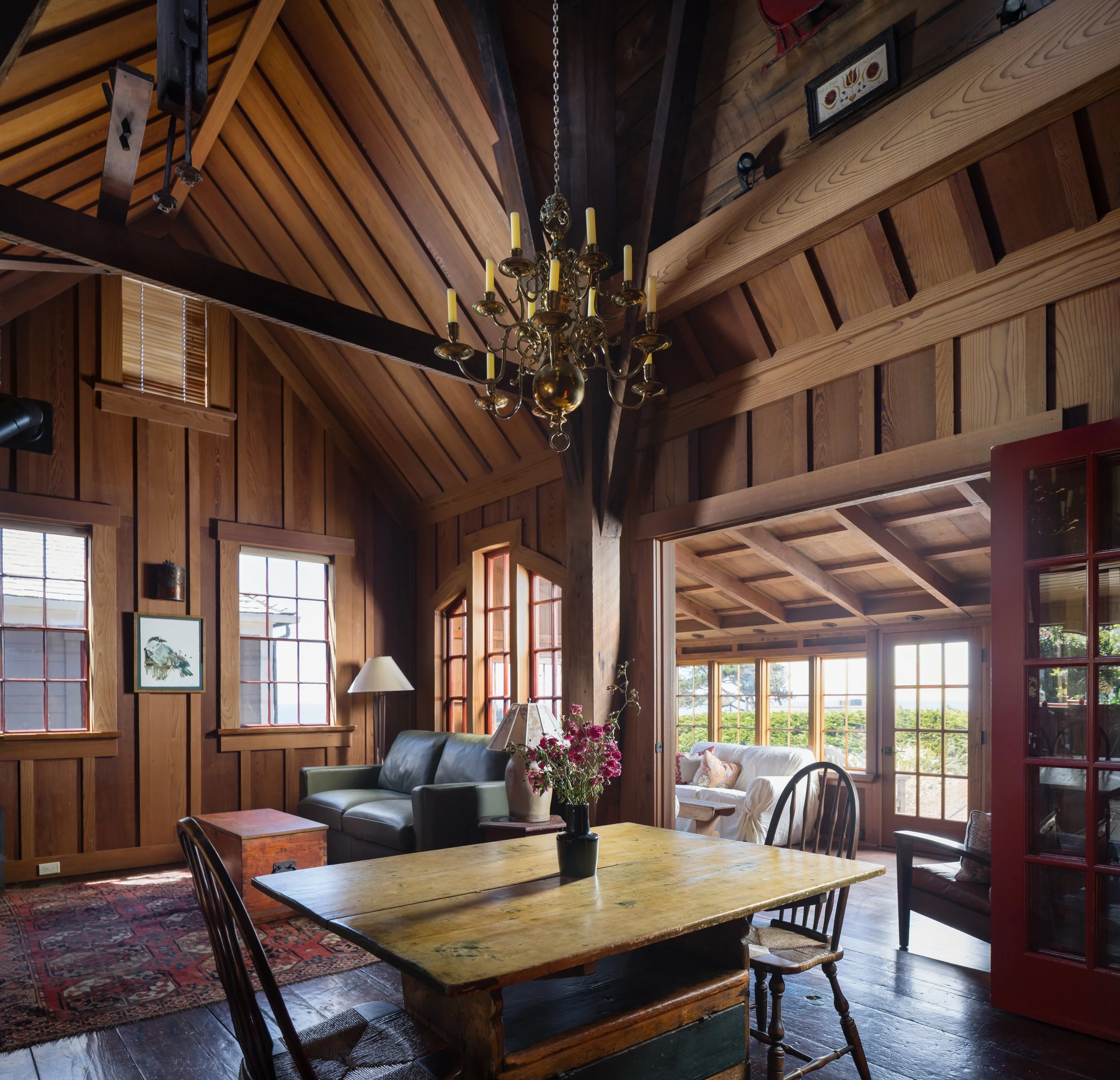
This is the interior of the historic Bettencourt water tower barn, built in 1888 in Mendocino, California. Restored in 2007, the former workshop was converted into living space while preserving the exterior and maintaining an interior that feels consistent with the building’s original character.
The vertical timbers still show the circular scoring marks from 19th-century milling, and the newer wood paneling was carefully selected to match the tone and texture of the original structure. Nothing here feels added-on or out of place — which, as it turns out, makes it both beautiful and deceptively challenging to photograph.
From a photographic standpoint, the primary challenge is conveying the vertical volume of the space — the sense of height created by the water tower rising directly above the room. Shooting vertically would emphasize that height, but it doesn’t feel quite right for the adjoining interior spaces, which are more naturally experienced in a horizontal frame.
Complicating matters further, there’s very little room to work with. In this case, I was already backed into a corner, pressed up against one of the main structural supports for the tank above. Backing up simply wasn’t an option.
Once I settled on 24mm as a workable focal length for a horizontal composition, that opened the door to one of my favorite tools for architectural photography: a 24mm tilt-shift lens. I don’t use the tilt function in my work, but the shift mechanism allows me to keep the camera level while moving the lens upward, expanding the field of view without introducing converging verticals.
I couldn’t capture everything I wanted in a single frame, but this approach made it possible to create a vertical panorama, later assembled in post-production, that preserves both the proportions of the space and its sense of scale.
The next major challenge is lighting. When you walk into this space, it feels warm and subdued, with soft views toward the surrounding gardens and the blue horizon of the Pacific Ocean. To the camera, however, it’s extremely high-contrast. If I expose for the interior, the windows disappear. If I expose for the windows, the interior falls into darkness.
I’m not of the mind that window views need to be rendered razor-sharp and hyper-detailed. That isn’t how the space is experienced in person, and forcing it usually looks artificial — like photographs pasted onto the glass. My goal is to offer a gentle glimpse of the surroundings while keeping the visual emphasis inside.
The existing window light is already doing some of that work, but it’s very soft and very warm, filtered through layers of interior wood. Over time, that bounce light loses clarity and contrast. Introducing soft, neutral supplemental light helps restore definition, color separation, and texture.
In this case, that meant using a pair of strobes fitted with parabolic softboxes and multiple layers of diffusion. Whenever possible, my primary light source goes outside the windows. Because this space is on the ground floor, that was easy to accomplish. My assistant positioned a 600 watt-second strobe with a roughly 40-inch softbox on a stand and moved it from window to window at my direction.
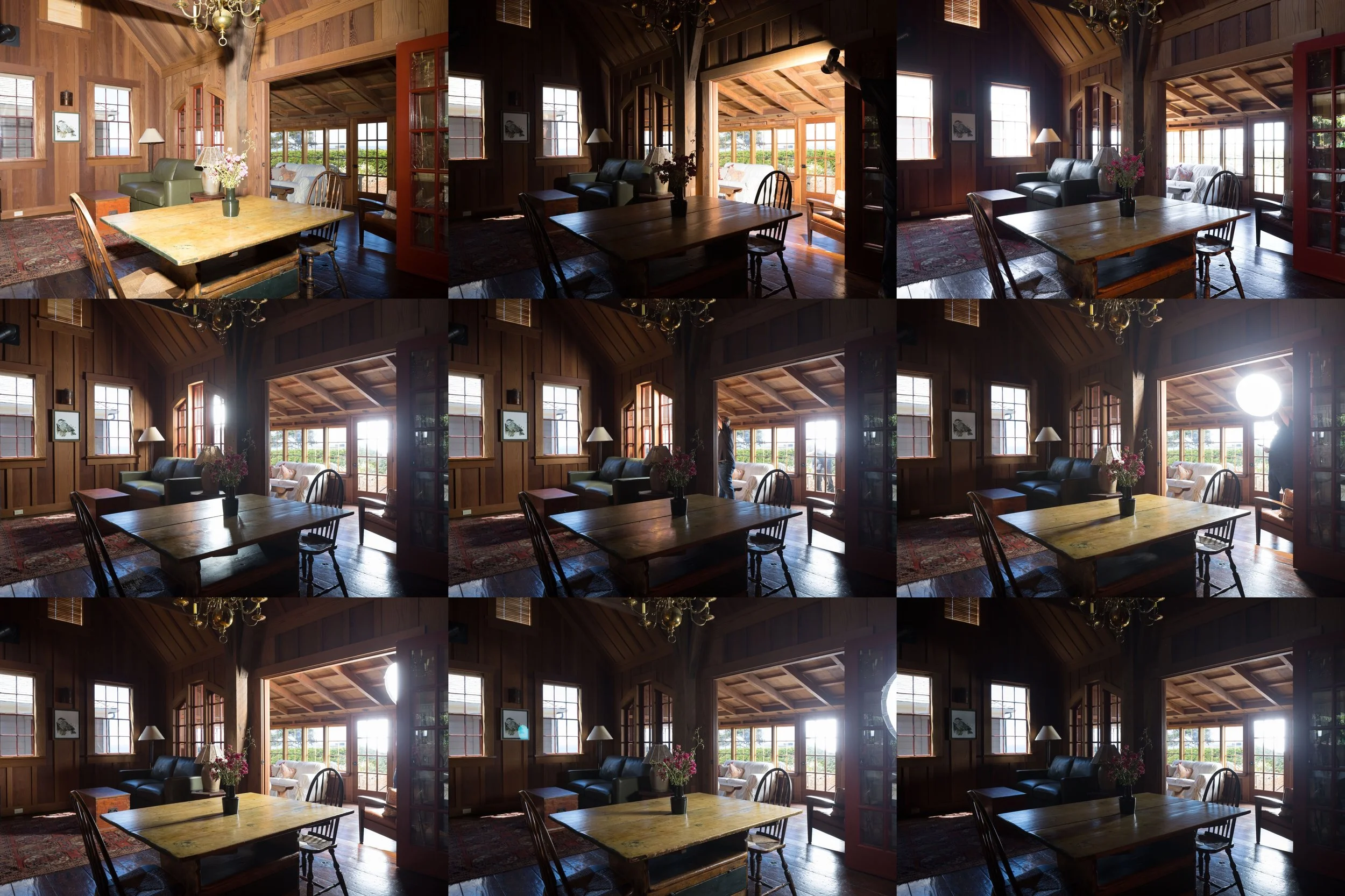
the frames used to composite the lower half of the vertical panorama for the final image
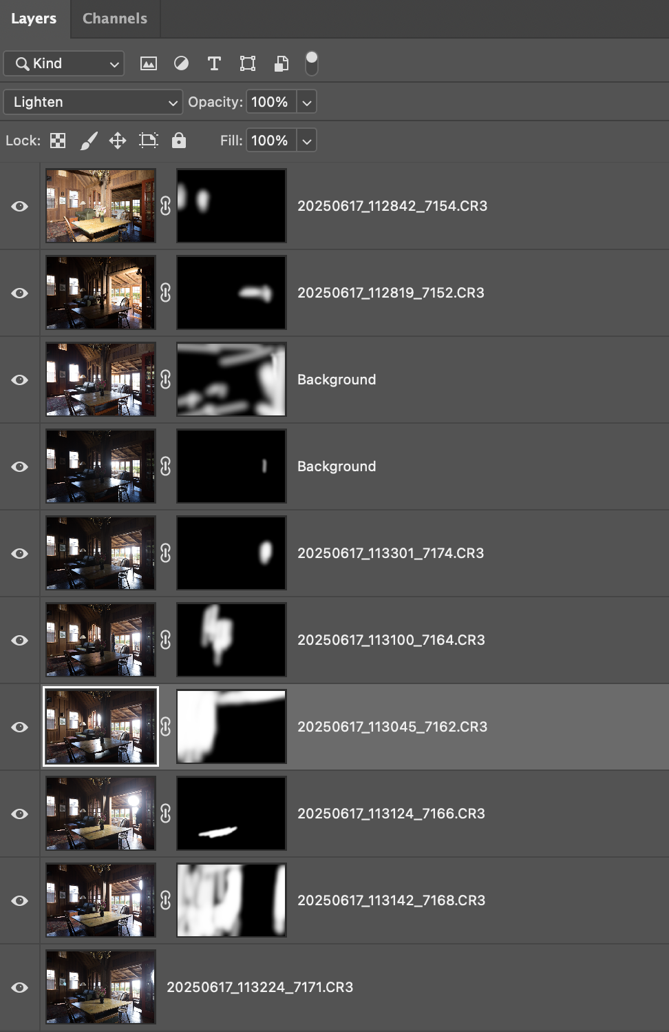
the layers and masks used in Photoshop to build the lower half of the vertical panorama. Different blending modes: normal, lighten, darken, and screen, are used as needed.
Placing the light outside is intentional. I want all supplemental lighting to feel natural and motivated. If the image works, the viewer should assume the light is coming from the windows — because in real life, that’s where it comes from. The window frames naturally shape and feather the light, allowing it to fall off into the room and create believable shadow patterns. When lights are placed inside, nearby walls often glow too evenly, subtly revealing the artificial source.
This space introduces another complication: the secondary interior room is separated from the garden windows by an interior wall with its own opening. The main exterior strobe can’t effectively reach that far into the space. To address this, I introduced a smaller, handheld 300 watt-second strobe with a compact softbox.
This light is used very carefully, with constant attention to how it interacts with surfaces and furnishings. Rather than trying to solve everything in a single exposure, I build the image in layers. One frame might focus on subtle rim light along the sofa. Another might emphasize texture on the far wall. Another might gently define the coffee table. Each exposure contributes a specific element to the final image.
Additional frames are captured specifically for the window views. For these, I deliberately over-light the interior. This makes it easier to extract the exterior detail later using layer masks and Photoshop’s Darken blend mode, which applies only the darker window pixels while ignoring the overexposed interior framing.
Once the lower portion of the composition is complete, I shift the lens upward. The camera remains fixed, but I repeat the lighting and capture process for the upper portion of the space. This second set of frames reveals the vertical volume created by the tower structure above.
After producing finished composites for both the lower and upper sections — with sufficient overlap — I merge them into a single vertical panorama. From there, I make final tonal refinements, check for ghosting or artifacts, and clean up any inconsistencies. Only at that point is the image truly finished.
Projects like the Bettencourt Water Tower Barn are a good reminder of why architectural photography is as much about interpretation as it is about documentation. The goal isn’t simply to record what a space looks like, but to convey how it feels to inhabit it — its scale, its materials, its light, and its atmosphere.
That process often involves careful planning, problem-solving on site, and a great deal of patience in post-production. Much of that work remains invisible in the final image, but it’s what allows the architecture itself to remain the focus.
When it’s done well, the photograph shouldn’t call attention to the technique behind it. It should simply invite the viewer into the space. That’s always the goal.
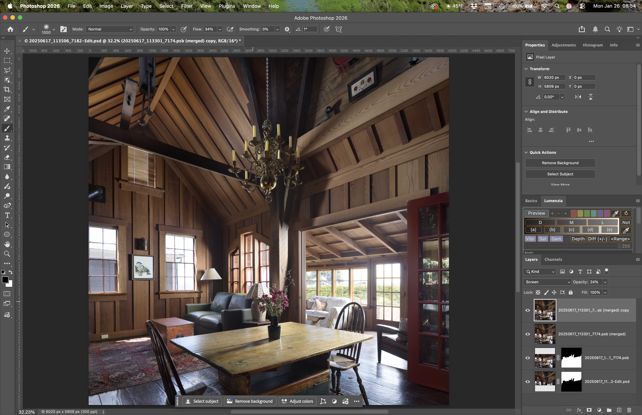
The final step—merge to panorama in Photoshop. I need to ensure that the right layers were used for the right parts—all the rigorous work of ensuring the furniture and windows looked right was done only on the lower half. Finally, I duplicated the merged version and applied a screen blend mode at about 20% opacity. I often use this as a final step because it helps mitigate my tendency toward moodiness in a way that makes it more approachable for most clients.